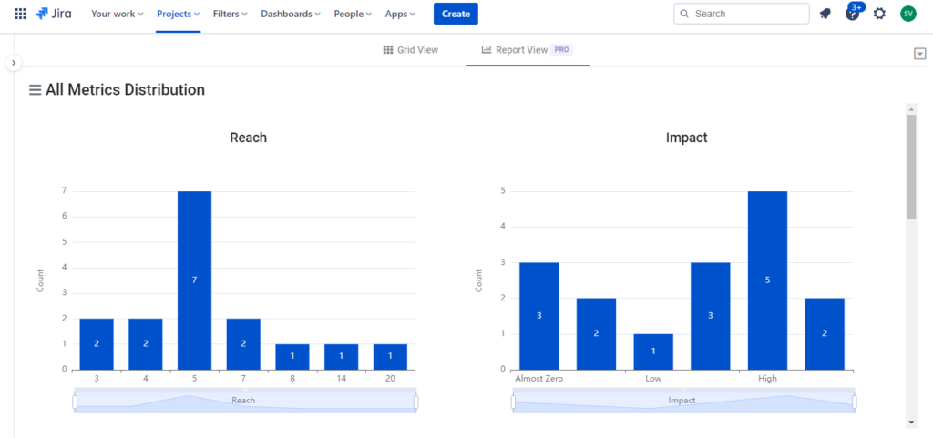
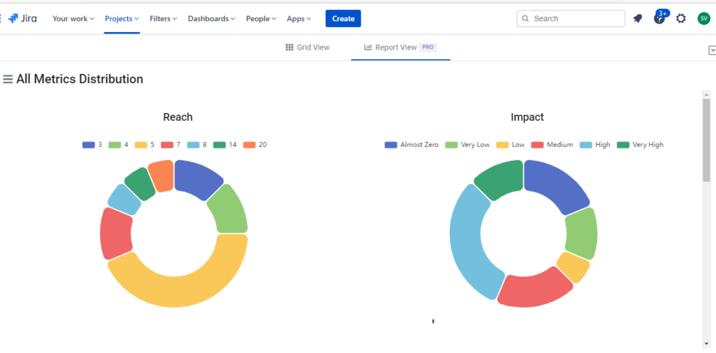
On one hand the Prioritization grid helps you update the metrics fast and sort issues by score. The Reports on the other hand provide a visual representation of how the issues are scattered based on the scores and help you to quickly identify where the energy should be spent first visually.
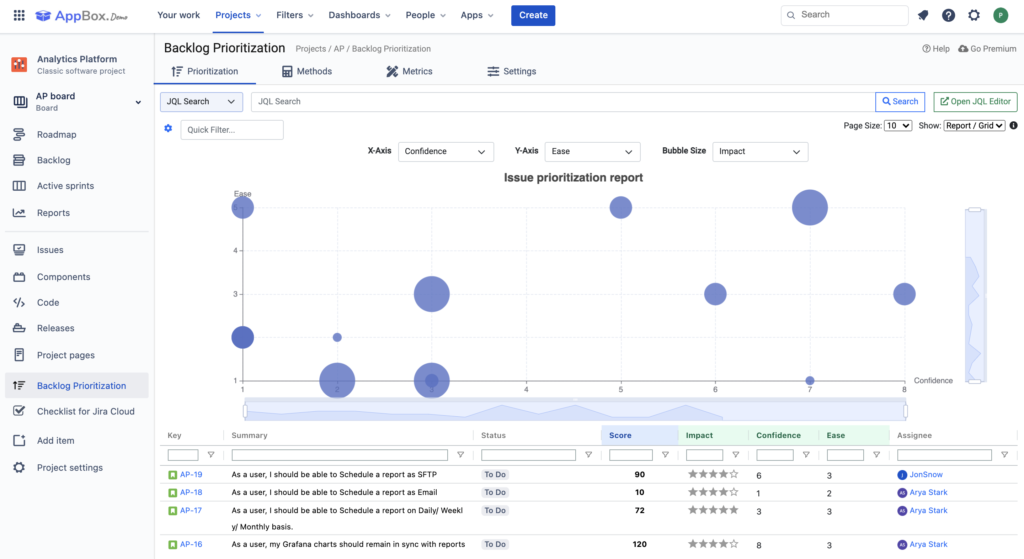
There are different types of reports to help users drill down on various aspects of the prioritization based on score and individual metrics.
Matrix Report The Matrix reports gives users an overall visual representation of the priority of issues and can be customised by assigning different metrics to the x and y axis ,color and size. Users can also zoom in on different aspects of the graph in order to understand it better.
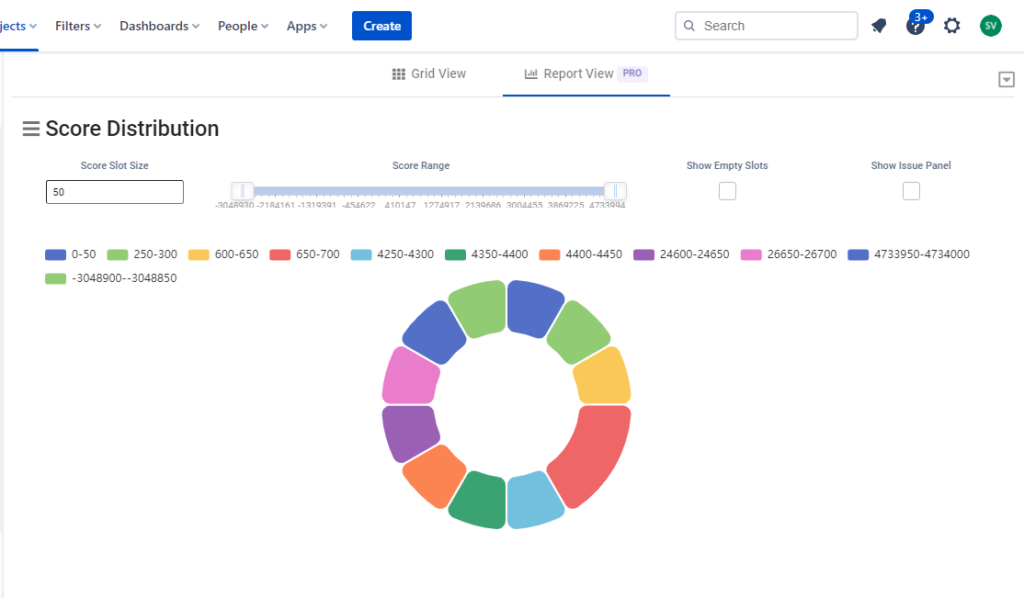
Score Distribution There is a bar graph and a pie chart that displays the number of issues based on their score.This can be drilled down further by defining a score range as well .
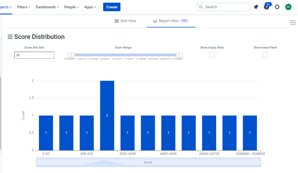
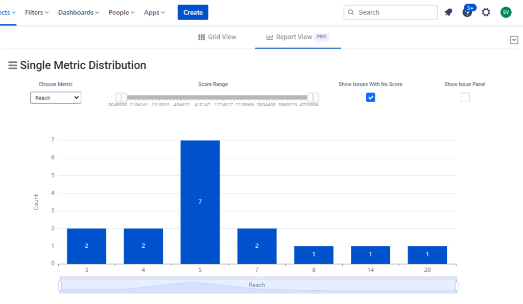
Single Metric Distribution There is a bar graph and a pie chart that displays the number of issues based on any one particular metric.This can be drilled down further by defining a score range as well .

All Metric Distribution There are individual graphs for all the metrics displaying issues for each metric range.
